— Neste Post
— Neste Post
01 — Overview
From a visual library to a prioritization toolThe Design System and the standardization process had already created measurable value across the company by reducing rework, improving experience consistency, and supporting operational, financial, and governance gains in earlier initiatives. As the SaaS modernization expanded across modules and squads, a new need emerged: to measure that impact more clearly, understand which screens had already been refactored, which still relied on legacy foundations, and how the Design System could inform product, engineering, and roadmap decisions through data.
- What was happening — Visual and technical modernization was progressing across different modules and squads, but there was no consolidated view of modernized screens, legacy screens, hybrid states, components in use, technical documentation, support tickets, or key friction points.
- Why it mattered — Even with the positive results generated by the Design System, it was still difficult to turn that progress into an ongoing operational view. Decisions around refactoring, documentation, and prioritization relied on information scattered across design, engineering, support, product, and multiple tools.
- What I did — I designed and implemented an internal dashboard that connected data from the screen inventory, Movidesk, GitLab, GitHub, Storybook, PostHog, and the product roadmap. I also used AI workflows, Claude, and Spec-Driven Development practices to accelerate prototyping, validate metric logic, and reduce ambiguity before the final engineering implementation.
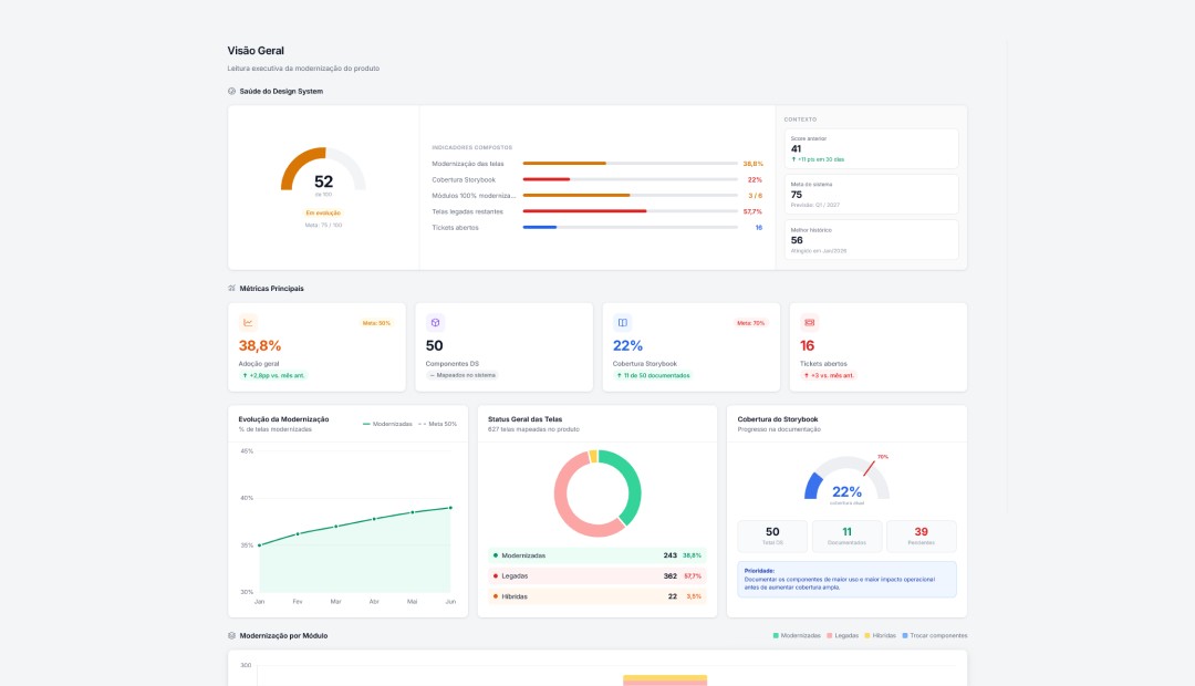
- What changed — The dashboard brought modernization data into a single view, showing screen coverage, major legacy gaps, component maturity, Storybook progress, critical tickets, and the areas creating the greatest impact on support and engineering.
- Business impact — The Design System was no longer tracked only as a visual library. It also became an operational management tool that helped teams prioritize refactoring, monitor risks, identify inconsistencies, and plan the SaaS evolution through data.
- Note
- Due to NDA restrictions, the screens shown in this case study use mocked and adapted data from the prototype created during the process, based on the solution implemented internally.
02 — Context
Modernizing a B2B SaaS platform takes more than building componentsPerinity is a B2B SaaS platform for Governance, Risk, Compliance, and Audit, used by organizations with complex structures, multiple modules, critical workflows, and high operational demands. In this context, modernizing the product was not only about redesigning screens or building reusable components. It also required consistency, traceability, and predictability across a large product surface that had evolved over many years.
The Design System was already an important driver for reducing inconsistencies, bringing design and engineering closer together, and accelerating the product’s visual and technical evolution. But as refactoring progressed across different squads, it became increasingly difficult to answer basic questions with confidence:
- How many screens had already been modernized?
- Which modules still carried the most legacy work?
- Which components were documented?
- Which ones generated the most support tickets?
- Was Storybook keeping pace with the product’s evolution?
03 — Problem
Modernization was moving forward, but the data was still fragmentedAs modernization progressed, the challenge was no longer limited to building components or refactoring screens. The next step was gaining a clearer understanding of how that evolution was happening across the product and which signals should inform team decisions. The issue was that the relevant data lived across different tools, each with varying levels of access, freshness, and context.
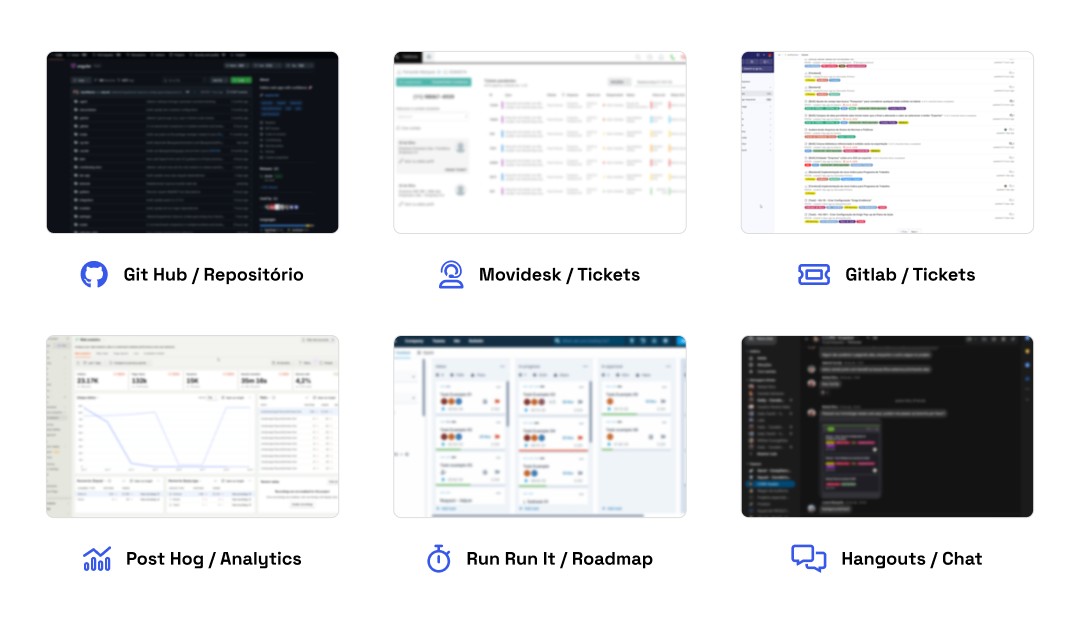
Some signals came from Movidesk, including support tickets and recurring issues reported by customers, implementation teams, customer success, and partner consultancies. Other inputs came from GitLab, where Product Owners, QAs, and Tech Leads logged issues. The roadmap tracked planned priorities for the period, while Storybook was still being rolled out without clear progress indicators. PostHog helped surface usage behavior, and internal chat contained day-to-day decisions and team alignment.
In practice, there was enough information to better understand the SaaS platform’s evolution, but no layer capable of connecting it into a single, actionable view. Without it, insights remained fragmented by squad, tool, or function, making it harder to identify the most mature modules, screens still dependent on legacy foundations, high-friction components, documentation gaps, and the areas that should be prioritized first.
This revealed a broader need: an observability layer that could turn the Design System into a source of operational intelligence. The dashboard was created to connect data on screens, components, tickets, technical documentation, adoption levels, maturity, usage behavior, and integrations, giving the team a clearer view of product evolution.
04 — My Role
Working across product, design, engineering, and applied AIMy role was to connect product, design, engineering, and data to turn an operational need into a functional dashboard. In addition to shaping the experience and defining the key metrics, I used AI within the design process to accelerate the creation of an interactive prototype, validate the solution logic faster, and reduce effort before involving engineering in the production build.
The goal was to create a tool that could support not only the design team, but also squads, Product Owners, Product Managers, and product and technology leaders in tracking modernization metrics, understanding bottlenecks, prioritizing refactoring efforts, and making data-informed decisions. My role therefore went beyond the interface. It also included defining metrics, organizing data sources, information modeling, and translating technical needs into a clear, actionable experience.
- My key responsibilities
- - Led discovery with stakeholders to understand which metrics were useful in the day-to-day work of designers, engineers, Product Owners, Product Managers, squads, and leadership.
- - Defined the dashboard’s initial scope, prioritizing the most important metrics for the first version based on the available data.
- - Defined the core metrics to track, including modernized, legacy, and hybrid screens, Storybook coverage, tickets, component maturity, and progress by module.
- - Mapped the relevant data sources, including Movidesk, GitLab, GitHub, Storybook, PostHog, the roadmap, and the product screen inventory.
- - Structured the dashboard’s information architecture, organizing the analysis areas into Overview, Adoption, Tickets, Components, Style Guide, Integrations, and Changelog.
- - Created an interactive prototype with AI support, using Claude to accelerate exploration, screen structure, component logic, and early solution validation.
- - Applied technical fluency to shape the prototype closer to the production implementation, reducing rework between design and engineering.
- - Turned fragmented data into actionable insights through visualizations that helped different decision-makers identify bottlenecks, prioritize refactoring, and track the evolution of the Design System.
The key differentiator was a hybrid approach that combined product thinking, complex systems design, technical fluency, and practical AI use. Rather than producing only a visual proposal, I built a functional prototype that was detailed enough to validate the product logic, simulate data flows, and surface decisions that would otherwise emerge later in implementation.
AI was not used as a superficial shortcut. It was part of a more structured process. With support from Claude and Spec-Driven Development (SDD), I broke the problem into smaller specifications, tested structural alternatives, reviewed information consistency, and moved the design closer to an implementation-ready model.
This approach increased speed without compromising judgment. It reduced rework, lowered the token cost of exploration, and improved delivery quality. AI served as a support layer for faster decision-making, while product direction, metric definition, and experience validation remained grounded in context, technical knowledge, and a clear understanding of team needs.
05 — Discovery & Insights
Lean discovery to understand what needed to be measuredBecause the goal was to create an internal tool to support product, design, and engineering decisions, discovery was intentionally lean and pragmatic. The priority was not to validate whether the problem existed, since data fragmentation was already felt in day-to-day work. Instead, the focus was on understanding which metrics would actually help teams track SaaS modernization and the evolution of the Design System.
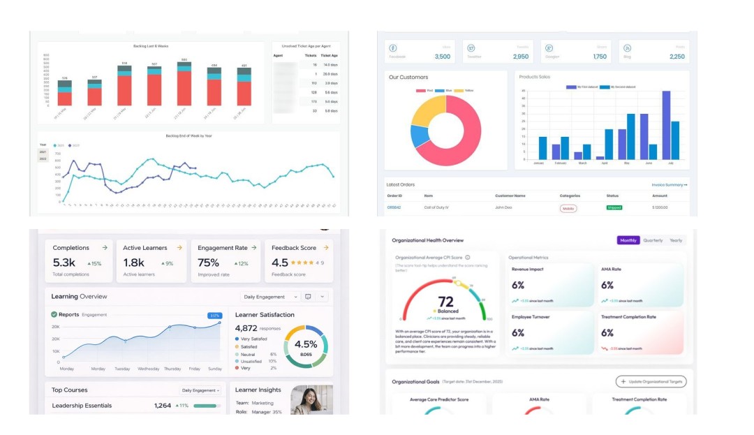
The research combined conversations with people involved in the process, analysis of how data had been tracked up to that point, and research into Design System metrics, modernization coverage, governance, technical documentation, and operational dashboards.
I also looked for existing spreadsheets, parallel tracking methods, and squad rituals used to monitor modernized screens, tickets, components, and documentation.
This process helped distinguish data that was merely available from data that could become a useful decision-making indicator. From there, the dashboard was designed as an evolving first version: starting with essential metrics and expanding as new sources, integrations, and needs emerged.
- How modernization was tracked across squads and whether there was any consolidated view of refactored, legacy, or hybrid screens.
- Which metrics would be useful day to day for designers, Product Owners, Product Managers, engineering, QA, and product and technology leadership to track product evolution.
- How support tickets and technical issues could reveal component bottlenecks, visual inconsistencies, or recurring problems in legacy screens.
- How to measure Design System maturity beyond component count, considering documentation, Storybook, testing, changelogs, examples, and ownership.
- Which external references could help define a more consistent measurement framework for Design System adoption, documentation, and governance.
- Key insights
-
1. Adoption should not be measured by individual components alone.
For this product context, measuring modernization at the screen level was more meaningful, since a single screen could combine modern, legacy, and hybrid elements. -
2. Storybook needed to be treated as a technical maturity metric.
Low coverage did not mean the Design System was absent. It pointed to a documentation gap that limited teams’ ability to scale adoption independently across squads. -
3. Tickets were important signals of operational friction.
Support requests and technical issues helped identify problematic components, documentation gaps, and screens with greater dependency on legacy foundations. -
4. The dashboard needed to be designed as a living tool.
Because not all data was fully structured, the first version needed to prioritize essential indicators while allowing for continuous evolution. -
5. A module-level view was essential for prioritization.
Comparing modernized, legacy, and hybrid modules helped identify the largest bottlenecks and determine which areas should enter the roadmap first.
- Additional methodology references
- Article Design System Metrics: What I Learned Leading Hotmart’s Design System for Five Years
- Article Building the Metrics Dashboard for Annecy, Banco Carrefour’s Design System
- Article How to Measure the Real Impact of a Design System
- Video Design System Dashboard Spreadsheet
06 — Product Decisions & Solution
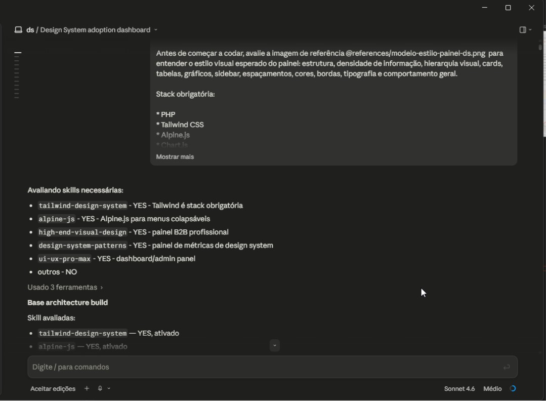
From AI-assisted exploration to a testable interactive prototypeThe solution began as an investigation into how to turn fragmented Design System data into a practical tracking tool. Before moving into a final implementation, I chose to build an interactive prototype to simulate the dashboard experience, validate the metric logic, and make conversations with stakeholders more concrete. This step helped reduce ambiguity, align expectations, and guide the technical build with greater clarity.
To accelerate the process, I used Claude to support screen structure, mocked-data organization, interface state definition, and information architecture reviews. AI served as a productivity layer to explore alternatives, generate an initial structure, and surface inconsistencies early, without replacing product analysis, metric definition, or decision-making judgment.
The technology stack was also intentional. I used a lightweight foundation with PHP, Tailwind, Alpine.js, and Chart.js to build a navigable prototype that was close to a production implementation. This approach also reduced the cost of AI-assisted exploration, since work with Claude could stay focused: rather than prompting for generic screens, I could work on specific blocks, reuse patterns, fix isolated sections, and evolve the product through smaller iterations.
After the initial structure was in place, the dashboard was built with mocked data to simulate realistic usage scenarios and validate whether the information made sense for different audiences: design, engineering, Product Owners, Product Managers, squads, and product and technology leadership.
The goal was to create a sufficiently functional version to test data readability, discuss priorities, and refine the dashboard logic before turning the proposal into a technical backlog. For that reason, the first screens prioritized were the ones most likely to create rapid alignment around the state of modernization.
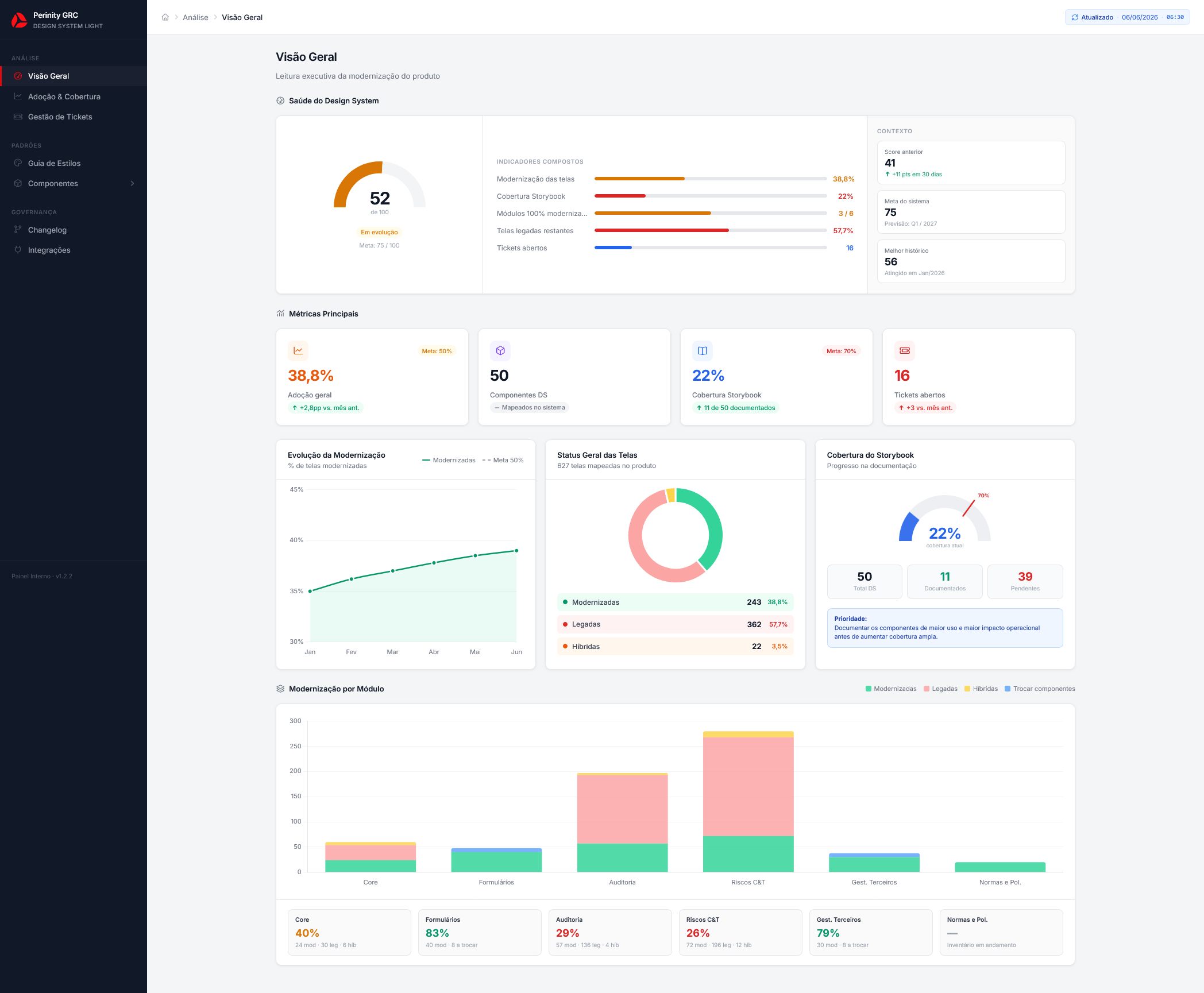
- Overview Screen
- Description: An executive-level view that consolidates the dashboard’s key indicators, including health score, modernization coverage, Storybook coverage, open tickets, and the distribution of modernized, legacy, and hybrid screens.
- Expected insight: Quickly understand the current state of modernization and determine whether the Design System is progressing in a healthy way against defined goals.
- Day-to-day impact: Makes leadership conversations easier, reduces alignment time, and creates a shared view of risks, progress, and priorities.
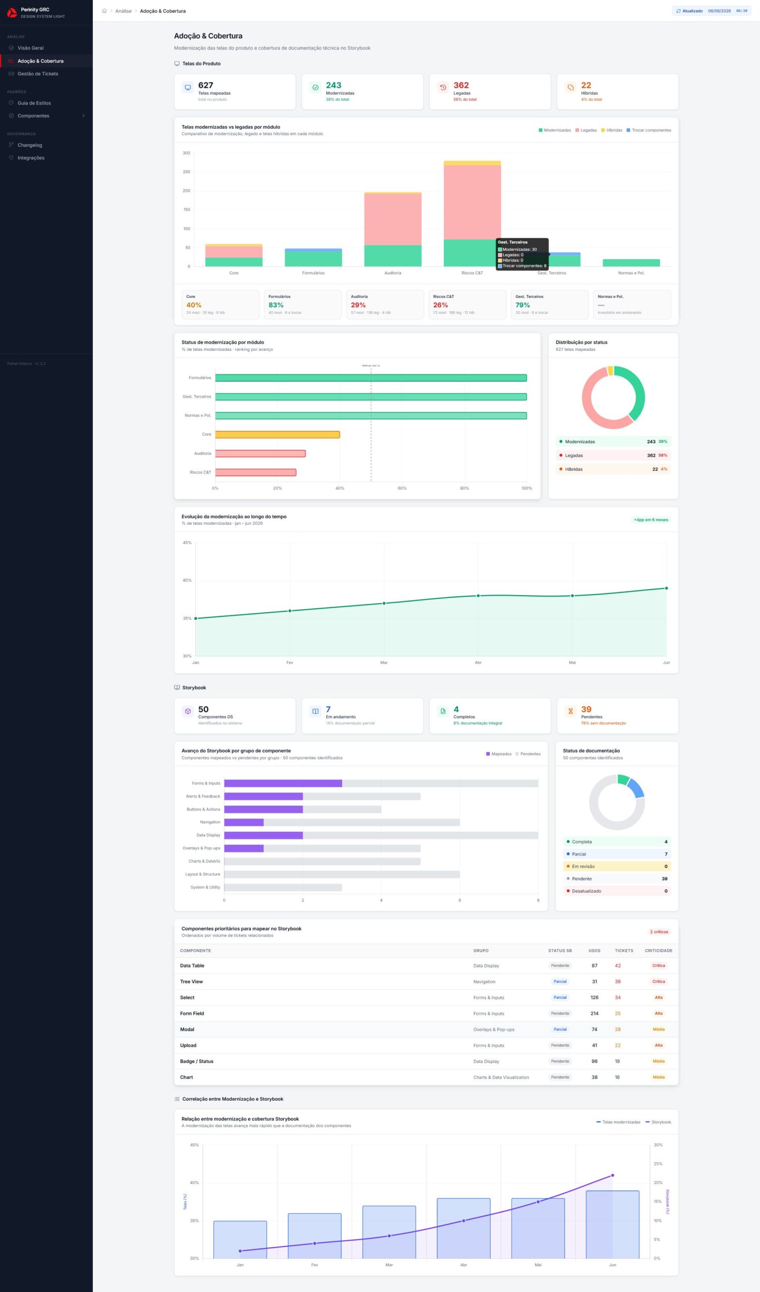
- Adoption and Coverage Screen
- Description: A screen focused on tracking modernization by module, comparing modernized, legacy, and hybrid screens while connecting that progress to Storybook coverage.
- Expected insight: Identify the most advanced modules, the areas that still carry the largest volume of legacy work, and where technical documentation is not keeping pace with refactoring.
- Day-to-day impact: Helps Product Owners, Product Managers, and squads prioritize modernization efforts based on evidence rather than perception or isolated urgency.
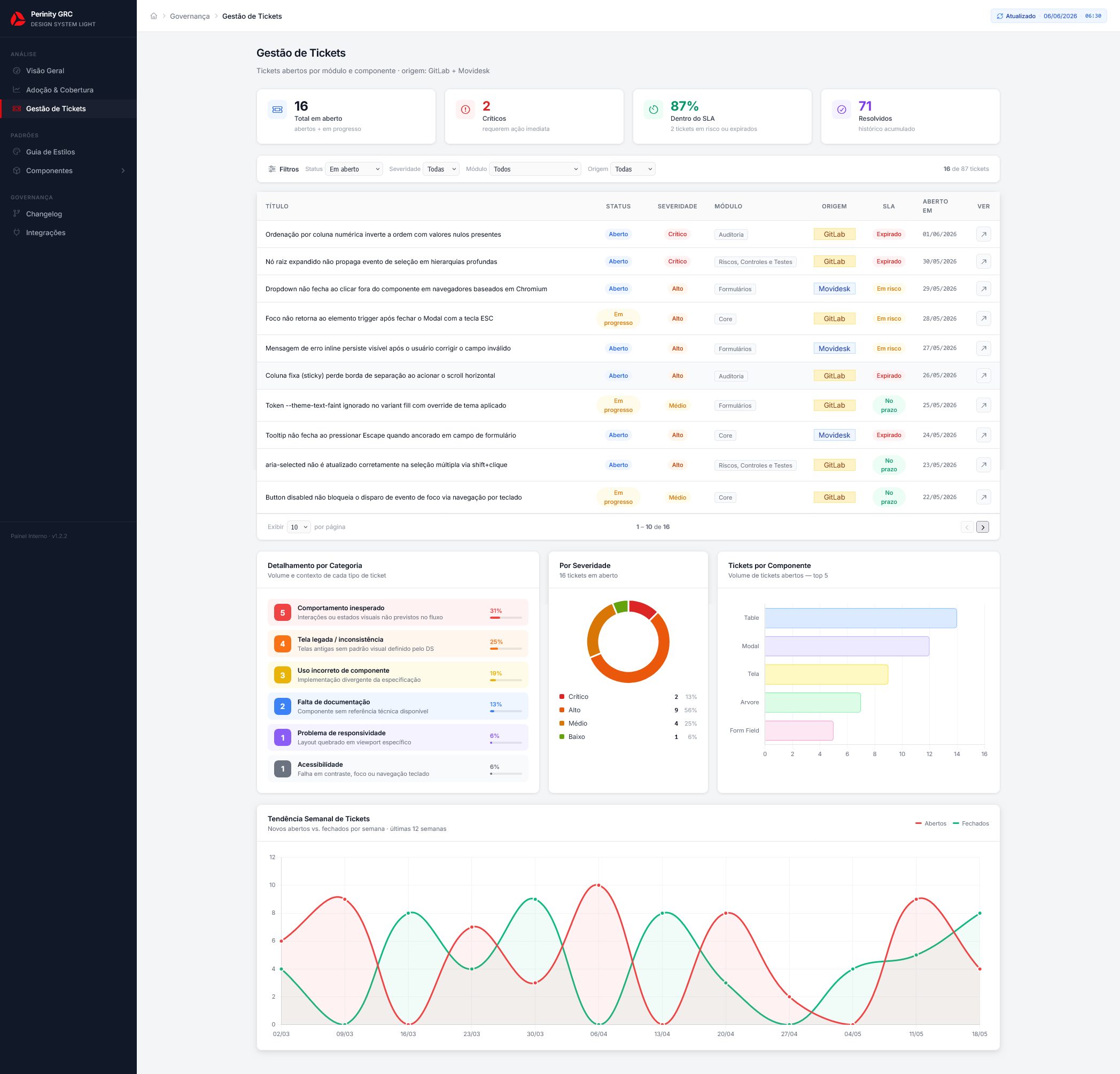
- Ticket Management Screen
- Description: A screen that organizes open and historical tickets by source, severity, SLA, module, issue category, and related component.
- Expected insight: Identify recurring friction patterns, components with the highest ticket volume, and problems that point to gaps in documentation, behavior, or usage.
- Day-to-day impact: Speeds up issue triage, improves prioritization between support and engineering, and helps turn tickets into inputs for Design System improvements.
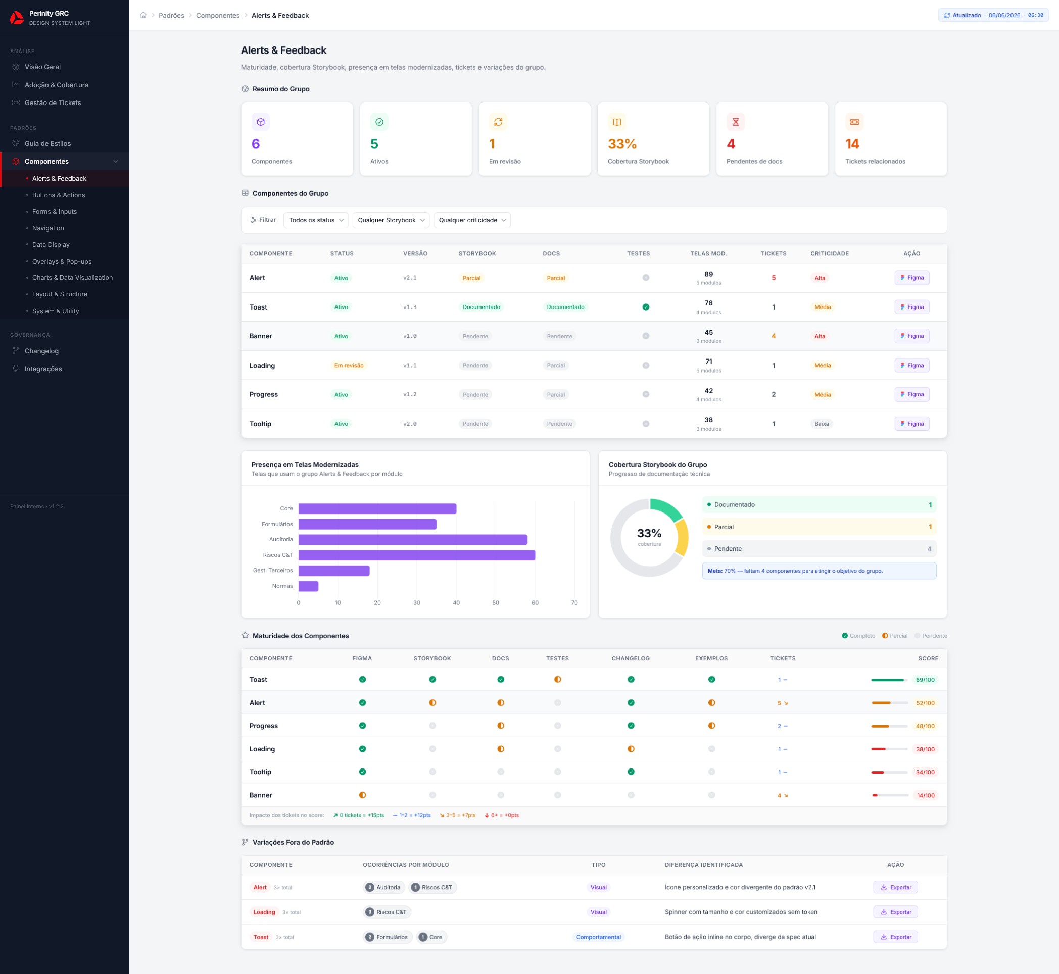
- Component Group Detail Screen
- Description: A dedicated view for analyzing a specific component group, including maturity, documentation, Storybook coverage, tests, presence in modernized screens, tickets, and out-of-pattern variations.
- Expected insight: Understand which components in the group are ready to scale, which require review, and which may introduce risk into future refactoring efforts.
- Day-to-day impact: Gives design and engineering clearer direction on what to document, fix, deprecate, or prioritize before moving forward with additional modernized screens.
It was an internal Design System tracking dashboard designed to serve as an operational lens for SaaS modernization. Rather than looking only at the component library, the dashboard connects data from screens, modules, tickets, Storybook, technical maturity, and integrations to support faster, better-informed decisions.
The interactive prototype helped validate the solution structure before implementation, align expectations across teams, and reduce uncertainty around what needed to be built. For this case study, it also served as the adapted foundation for a public presentation, preserving the dashboard logic without exposing sensitive information.
07 — Technical Validation & Impact
Validating the solution before implementationValidation also helped distinguish what belonged in the dashboard’s first release from what could evolve later, preventing the tool from becoming too large or difficult to maintain from the start.
The biggest impact was reducing uncertainty around what needed to be built. Rather than starting from a conceptual idea alone, the team had a navigable product model with screens, metrics, filters, and data relationships. This made technical discussions more concrete, accelerated cross-functional alignment, and created a clearer foundation for turning the dashboard into an internal product.
08 — Learnings
A Design System should also be measured as a productOne of the main lessons was that a Design System should not be evaluated only by the number of components created or the visual consistency it delivers. In an enterprise product, it also needs to be measured by its ability to reduce friction, support refactoring, inform technical decisions, and provide better visibility into the SaaS platform’s evolution.
Another important lesson was refining how I apply AI within the product and design process. Instead of using Claude only to generate screens or speed up isolated tasks, I combined Spec-Driven Development (SDD), context-structuring techniques, technical fluency, and supporting tools to make AI part of a more controlled, iterative, and reliable workflow.
By breaking the problem into smaller specifications, running short validation cycles, reusing established patterns, and providing more focused context to the AI, I reduced rework, lowered the token cost of exploration, and reached a functional prototype faster, closer to implementation logic. This made AI use less generic and more connected to the product reality, the technology stack, and the decisions that needed validation.